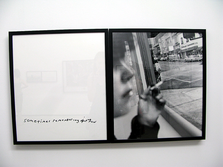
Of all the photographs with writing on them, I think I was attracted to this one the most because of the cohesiveness of the image. The fact that the image was re-photographed with the text allowed me to believe that it belonged there. Although I find it a little cheese, it works. The font is appropriate for the image and subject and the picture has none of the cliché that the words hold.
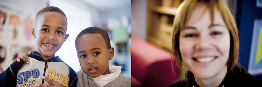
What first caught my eye about this diptych was the focus on the woman's hair and not her face. because of the depth of field and perfect exposure the image implies professionalism or at least a professional camera. However the focus reverts back to the fact that its still just two kids playing with the camera. it is a beautiful balance between playful childishness and decent technical quality.

Though this image is not the image of the stranger, it was a product of the conversation that ensued. The interaction between the photographer and the stranger he photographed lead the photographer to this place and this image. Aesthetically, it is one of the better pictures from the assignment, but conceptually I think it fits with Soth's purpose beautifully. it is all about the idea of going back to the basics and then letting that lead us out again.

I chose this image for two reasons, one the light and two the color. first, the play of the light across the child's shirt and back into the shadows very interesting. At the same time, none of the details in the shadow arias are lost. Secondly, the blues in the image fit so well together. the range from desaturated blue of the carpet to the bright blue in the upper left, the green blue of the shirt to the pink of the run and the child ear; it is all so well coordinated and balanced it could be a color study.
No comments:
Post a Comment