Monday, April 18, 2011

John Pfahl


With in this series John Pfahl shoots through a series of windows, often with picturesque or at least distinctive views. In his artist's statement, he mentions the idea that his view point is controlled by the vision of some one else, the architect, the decorator, the landscaper, etc. I think it is this idea that draws me to the series more then anything. The project is a lot like a school assignment; he is given a preset frame and scene but then it is up to him to make the subtle movements that bring together a composition. In this case, the centered cars and building are the major compositional element while angled lines of the pavement, and the perspective on the building play minor directional roles. More then anything, the richness of the texture and grit in the color is what really brings this image to life. The browns in the pavement and blues in sky as well as the yellow light bulbs really create a beautiful atmosphere.


In this image, the window almost turns the photograph into a strange sort of triptych. the careful placement of the window panes flattens background into what could easily be another photograph. To prevent this from totally flattening the image Pfahl includes a table and book in the foreground. Though the book cover is not perfectly clear, the colors and formation on it seem to reflect what is just outside the window. Though it may be a tint on the window, the center pane appears much lighter then the outer two. Although this does allow for more detail in the trees and land below the rays of the sun, it mutes the right yellow and blue that show up in the other two windows as well as the book. 


This window is different from his others in that the surface is more the subject then what is beyond. The broken glass and wire mesh give the air of an abandoned city building. This in combination with the angular form that is beyond the window makes me fairly certain that it is in a city. When composing this, Pfahl was carful in his placement of both the vertical and horizontal elements of the picture. Rather then shooting the window just perfectly dead on, he moved to make sure that the vertical edge of the building lines up with the thick vertical window pane. Horizontally, he divided the back ground into three parts. The sky takes up one row of frames, the grey part of the building takes up two, and the darker section covers the remaining two.


Monday, April 4, 2011

Joel Meyerowitz


When thinking about Meyerowitz work, it is important to keep in mind his intent: to capture as completely as possible the feeling, the atmosphere, or a scene. His use of the color is supposed to be a purely accurate description of what he sees. As simplistic as this seems, it is interesting to look for what it is that he chooses to include. Though he is trying to be honest in his 'document' of the environment, he is still making choices as to what to include and what not to include. In this image, for example, he makes the decision to include the car, and not just a little bit of it. He portrays the feeling of this particular place as the tan interior of what looks like an overheated van. Some how, the inclusion of so much of the van makes it feel warmer. Although I am sure it is hot outside too, the color of the interior and the way the light falls through the windows amplifies and confines the feeling in a way palm trees and blue skies wouldn't.


In this image, it is the handling of what is in and what is not in the frame that really show Meyerowitz attention decision making. He places the frame in such a way that he can get the most out of the scene. From the sliver of a man on the far left to the person entering the frame on the right, from the central figures knees to half way up the skyscrapers behind them. It feels like each decision he made was something of a compromise; he chose to leave out the feet of his subjects to show the little bit of the sky that gives the city its feeling of ascension. He cut back on the man to the left to show the motion of the one on the right. Perhaps the most striking feature of the photograph is the strong diagonals coming from either side. Though the close in on the picture, they are characteristic of the depth and seeming endlessness of the streets in the city. 


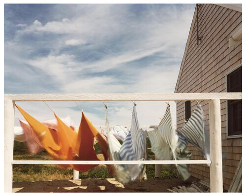
This photograph stood out because of the blatant use of the limitations of the photographic medium. In much of Joel Meyerowitz work, the camera becomes lost in his attempt to include as much as possible. Here however, he is not trying to hide the camera; instead, he uses the limitations of a slow shutter to enhance the feeling of wind and motion that the picture has. The wispy clouds and the swirl of the laundry play off each other, giving the impression of a gusty day. This is counteracted by the solid form of the house which fills the right half of the frame as a imposing force, there fight the wind. Though the close crop and use of motion blur seem to depart from Meyerowitz typical style, he uses them effectively to portray the feeling of that particular moment.