
Though this image follows the documentary style that bothers me so much with most of Shore's work, I find the picture interesting in a way that is uncommon for this upfront, building photography. The juxtaposition of the white, brown and gray houses. Though different colors are normal and even expected, the uniformity of the designs give the impression that they should look the same in all other ways too. The flat, upfront approach serves to add to this feeling of expectant uniformness, all of which is shaken by the shift in color.
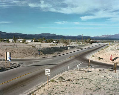
This photograph is made up of a lot of little details that dont really strike me as that important until they are all added together. The shadow of the road sign of the far left points in to where darkened part of the road and the white line form twin arrows. The shadow of the do-not-enter sign hits the hill in such a way that it parallels the upper arm of those two arrows. The dark streak on the road is balanced with the darkening sky on the opposite side of the frame. In the same manner the white of the no-right-turn sign is balanced by the back of the sign on the left.

To use Ron's favorite hypothetical portfolio review question, "Why should I care about this?" I honestly dont want to look at Shore's McDonnell's meal. Not only is the subject totally bland but the handling of it is just as flat. Flat overhead, florescent lighting, no highlights no shadows. Strait on I'm-about-to-eat-this-but-I-have-my-phone-so-I'll-take-a-pic-and-send-it-to-my-bff view. Oh and he doesn't even take the time to balance the pole sprouting out of the top. He didn't bother to move a couple inches to get rid of it, or a couple inches in other direction to balance it with something on the bottom. The graffiti has potential and thats probably what he saw, but really, it just didn't work.
No comments:
Post a Comment