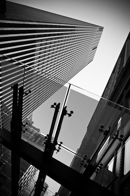
In this picture the buildings and the sky interact to create an almost abstract image of geometric shapes. the key shape is that of the sky. A slow shutter speed was probably used alone with some serious dodging to achieve the tone and blur in the clouds. A wide angle lens was probably necessary to get a view that includes so much of the buildings on each side. Though it looks almost HDR, I would guess that it is just a lot of dodging and burning based on the light on the edges of the buildings.
Monday, December 13, 2010
Jason King
This is another photograph that shows that uses a dynamic negative shape to connect the architecture. Here smaller elements are used up-close to act as similar elements as the buildings. The light and the banner both feel as colossal as the buildings and function on the same plane as them. The curve of the light post and the arches on the building relate easily to the ripple of the banner. The corner of the building in the bottom left closes off the negative shape though it remains open on the other side. The sky is slightly gradated which contains the photograph space slightly but it still feels a little too open to me.
Eric Kim
After seeing Eric's photography, I have started being more aware of the space and negative shapes made by buildings in the city. This photograph is an especially strong example of how that negative shape can be used to activate the photograph. The titled camera allows the overhang to keep they diagonal zigzag going rather then grounding it as it would if that heavy black line were horizontal. The sky is handled by some subtle vignetting in the upper right hand corner. This gradation of the sky contains the photograph, allowing the eye to continue in a circular motion around the frame.
Monday, December 6, 2010
Matt Weber
Flat photography usually dont interest me but in street photography, I really like graphic element it adds. The shapes of the railing and the mosaic activate the space, balancing each other out. The girl adds the crucial element of interest being the subject. The scuffs on the wall appear to be confetti spewing from her outstretched arm; her upturned face drawing the attention into the picture. Her shape is perfectly balanced by the inclusion of the protruding piece of wall decoration in the opposite corner.
The dramatic light created by the fog here really makes this picture. The contrast between the soft and swirling fog and the hard edged city seem to pull the human shape between two worlds. The fact that the figure is fully covered by the fog allows it remain some what isolated from the city. The lines from where the street meets the buildings draws the eye into the center as do the verticals above it. The distance from which the picture was taken makes it feel more like an intrusion on a surreal almost ritualistic moment.
The real strength in this picture lies in the subject, 9/11. However it's unconventional view of the towers shows a side of it not seen from the plethora of after math pictures shown in most newspapers. The inclusion of the children who are completely oblivious to what is happening around them and the mother, forced to ignore it so she can continue taking care of her kids turns the focus towards the affect on the rest of America. The diagonals in the image draw the focus to the distant and muted towers while the contrasts make allow the figures to maintain the center of focus.
Saturday, November 27, 2010
Ian Smith
The tonal range of this photograph is what really draws me into it. The shades on the hall of the sip, the white of the surf, the details in the sky, every surface has a full tonal range in the textures that cover each surface. compositionally, the photo is basic and strong. The diagonal chain draws the eye in to the diagonal that the axis of the ship makes, perpendicular to that of the chain. The foam on the beach mimc curve of the hull while the clouds balance the ships reflection. Technically the image is eloquent and well refined. Conceptually, there is also a lot to work with. The image of the anchor and the chain both lend them selves to some form of captivity, an idea very appropriate for a beached vessel. The angle of the ship makes it seem like it is almost straining against the chain, fighting to get free. Yet at the same time storm clouds are forming overhead.
Though this picture is by the same photographer, of the same subject, the image is no where near as successful as the first photograph. The choppy water and blank sky are what really destroy it; the size of the waves take away from the monumental feeling of the other image, while the bare sky bleeds out a lot of potential tension, not to mention the fact that it takes up two thirds of the frame with absolutely nothing. The slightly tilted horizon is just enough to annoy with out really adding anything to the picture. This is what much of Ian Smith's photographs looked like, relatively unimpressive, rather snap shot like.
Everything that was done wrong in the last image seems to have been done right in this one. The photographer took advantage of the size of the ships to get right up close, turning them into looming shapes. He used the ropes to draw the eye up into the center where the ships meet creating an x shaped composition. The smaller ship on the right and the water line and the water line on the middle boat both serve to continue the horizon that appears only in a fraction of the frame on the far left. The sky is a slight gradient moving from white to a light grey on the right hand side, framing the middle craft. All of the elements are well handled and thought through; there is none of the randomness that destroys of some of his other images.
Tuesday, November 23, 2010
Hierarchy
To illustrate hierarchy, I plan to use human relationships as shown through gesture and body language. With the pictures I intend to destroy the traditional thought of hierarchy as all encompassing levels of importance and show it as the intricate micro-relationships that actually make up society.
This first image is a Henri Cartier-Bresson shot. It is easy to assume this is a grandfather-granddaughter relationship because of the protective way the man surrounds her. The direct eye contact and crossed legs show a confidence bordering defiance directed towards the photographer. Doubtless this is brought on be the presence of the man whose hands and legs surrounds the child. Heretically, the man is more important; he is older, wiser, part of the work force, probably the main provider for the family; however the photograph shows him as protective and comforting. These are the type of relationships I want to use to show human hierarch. Though I do not intend to stage my photographs or even allow my subjects to know they are being shot, the photograph still shows the type of relationships I want to portray.
Here, the photographer, Lev Tsimring, captured a far more subtle hierarchy. The relation is between three supposed siblings as the two eldest teach the smallest child to ride a bike. The tallest of the three wraps his arm around the child on the bike as though lifting him up to take him off the bike which is too large, probably a possession of the older boy. There is a clear hierarchy between the three, but the way they are helping each other shows how social relations are used to support and help people.
Handshake by Laurent Roch shows clear hierarchy. The seated verse the standing, the way the man on the left stoops over to sake the other man’s hand, the embroidered hat and the uncovered head, all of these contribute to the feeling that these two are at different social levels. Despite this, the image catches the moment of meeting. In this introduction, their faces show genuine surprise and pleasure at the union, complicating the hierarchy of the positions. It seems to lead to a moment where the seated man stands up to greet the other, symbolically a removal of the previous hierarchy.
Though this picture is about the juxtaposition of the food add and the family Julian Legrand captures the relationships without the conventional use of faces and heads. The relation of the three is made clear by simple body language. The largest figure is probably the father; his wife is to the left and a son with his hand over the man’s shoulder. The lack of heads in this shot is what really draws me to it; this is a technique I may try with my own pictures to focus on the way people orient themselves around each other.
Another Lev Tsimring, this picture is a very comical take on the idea of hierarchy. The expensive looking sweat pants, the loose baggy jeans, and then the canine. It is an easy line up to see hierarchy in an amusing light. As with the last image, the photographer chose to crop out the heads of the people, focusing in on the symbolism of the way the figures are clothed (or otherwise).
The idea of hierarchy is often characterized by a conflict or struggle that establishes that hierarchy. This picture by Richard Ford shows a checkers game by tow people who seem appear to be foils. They are close enough in age that they appear to be well matched competitors. However, they are opposite in build and dress. Their respective dark and light suits seem to mimic the conflict on the board, personalizing the checkers game.
This photograph by Lukas Vasilikos shows a very clear hierarchy: that of the family. The progression of youngsters surrounded by their parents is mimicked in the sign on the shop window of the human evolution. Though the comparison is comical, the family hierarchy is none the less present. In terms of how it manifests its self visually, the parents are shown walking at the front and back of the procession of kids, shepherding them forward.
The correlation between figures here is made by the shopping bags. The photographer, Michael Penn makes the connection between the child and the two adults in the back ground with the triangle of white plastic grocery bags. These forms seem to hint at the bags that they homeless carry their possessions around in. The child seems to be following the example of the figures before him, carrying around a bag too large for him to lift off the ground while still struggling to move forward.
This is another shot by Richard Ford. In this one he shows a clear progression in line of people as their heads steadily get lower in the frame. Although this arrangement appears to be simply lucky placement, the implication is of some social order that reflects the importance of each person in the group. Besides their position, there is nothing to suggest any form of hierarchy between them. They are all of approximately the same age and appear to be off similar economic background, but the placement of the head is such a symbol of authority that the progression overrides all other symbols in the photograph.
Any form of line implies a hierarchy, some sort of order of significance that being shown the apparently organized position. In this photograph the reason behind the order can only be guessed at. The three standing elderly people appear to be looking down on the seated woman who waits like them next to the street. A fourth figure also looks towards the seated woman; she, however, stands apart from the others, implying a social distance, though not as great as the distance between the three and the figure farthest to the right. The slow shutter speed allows the moving crowd to blur away into the back ground, bringing the visual relation of the four standing figures into sharp focus.
Sunday, November 7, 2010
Jeff Wall
Jeff Wall
Though his work looks candid, Jeff Walls photography is staged. The scene of chaos here, though nor ordinary, certainly does not look impossible. All of it seems to be just lucky timing. It is not the setting or the subject that make this picture interesting, it is the relation between the characters; the way they interact gives implies a level of depth otherwise missing from the shot. This is something that I have been striving for with my peter pan work. and is probably the hardest part of my process. To create this tangible relations and interactions with out making it seemed posed is a lot harder then a shot like this shows.
In this picture, it is the inclusion the minor, apparently inadvertent details that transform the shot. Though the wet floor and paper boats are an obvious stage, details like the plant, trash in the wastebasket and the open filing cabinet make it appear more candid. The clock and light from the window give an apparent time and setting for the entire thing. Even the name "8th Floor Office Park. 4th February 2009" attempts to add to the documentary facade. All of these are critical details to making a set up like this work. Whether it is with paper dolls or in an office, the details are what transform the stage.
Even though the grave of flowers is clearly the subject here, Wall doesn't resort to simply recording the oddity he has created. He continues to add little details to push the photograph further and further. The absence of people is made up for by the hoses in the back ground and shovels in the foreground imply. Both of these add the element of narrative to his strange flower grave. An intriguing comparison for this photograph is the tree in the grave by Goldsworthy. Both have similar subjects but both are handled very differently. Here, the strangeness of what is seen is elevated by the normality of the setting: everything seems normal, except the grave of water and plants. With Goldsworthy, the creation of the unusual is stressed by the forward approach to the photograph.
Subscribe to:
Posts (Atom)