Monday, March 21, 2011

JoAnn Verburg


In the photography of JoAnn Verburg, the selective focus and focal planes of the eight-by-ten she shoots with are used to dramatize her otherwise ordinary subjects. Even in this image, a situation where the view camera would be ideal for maximum depth of field, she choses to place the focus on the first window, letting the viewer guess at the rest of the image. Her typically pastel color pallet lends its self to the air of mystery present in so much of her work. Formally well composed, this image takes a more geometric approach to composition then much of her other photography. The dark triangle in the bottom left balances the light triangle formed by the windows in the top right. The slice of ground that leads to the door on the right is played off with the inclusion of the structure behind the wall on the top of the same side.


More so then the previous image, this photograph is characteristic of Verburg’s whimsical, dream like, style.  Once again the bright day light and pastel colors suggest a happy, cheerful place.  The entire image is a balance between the blur selective focus and the crisp points where she brings out her chosen subjects into sharp clarity. Here the close tree branch and then the tree behind it are the subject of her focus. This duality suggest a macrocosm-microcosm theme in which both the individual part and the group as a whole are shown in comparison.  


Diptychs, triptychs and polyptychs make up another facet of Verburg's work. The choice of devisions with in this specific piece are especially fascinating. across the horizontal borders, the images line up fairly well, the news paper seems continuous as do the tress and wall. However, when moving vertically the transitions are less smooth. Here the movement from one set to the next is prohibited by the focus selection, a deliberate tool which JoAnn Verburg enjoys using. At first glance the leaves above the man appear as though they belong below him. the selective focus masks the wall that they sit on and puts the bench in an underground world. Once again the soft focus on the trees plays an important part of the transition. She effectively throws the top set back ground by choosing to only focus on the upper half of the images, making them feel distant while still retaining detail in the upper parts. 

Sunday, March 13, 2011

Lynn Saville


When I saw the title of Lynn Saville’s book “Night Shift” I immediately knew I was going to enjoy the work. All night photographs in full color, all brimming with the tones and shades of a thousand street lamps and outdoor house lights, the series is an investigation of the beauty of artificial lights. In this specific picture, the green interior light spills out onto the pavement, looking like an alien presence in comparison with the natural blue and slight pink of the sky. The bridge overhead breaks up what mass of blue creating another formal element that plays off of the dark building, almost becoming a continuation of it.  

Thomas Demand


Demand's pictures are purely about formal relationships. The tightness of the compositions in terms of both line and color turns his photographs into what could by a 2D study of composition. Though the images are of spaces, he uses stopped down apertures to achieve a depth of field long enough to flatten the space into one plane. This particular image is comprised of parallelograms of varying sizes and colors. The larges elements are the orange and blew of the two tables, the turquoise of the floor and the gray of the two machines. Each of these shapes is balanced by the smaller shapes the break up the larger masses, the telephone, control box and plastic tubs. Every border is engaged while the space within is fully activated.

Miguel Rio Branco


I stumbled across this photographer in the library while shelf-reading and was immediately intrigued by his use of color. His photographs move between documentary subjects with a fine art eye, as is the case here, and Nan Goldin style subcultures of Brazil, with low light and lots of motion blur. In many of his photographs, Miguel mixes light temperatures to achieve the range of colors his images exhibit. In this image, the subject is the shoe that is falling apart; however, the interest of the photograph is the color play between the blue smoke and rocks and the read earth. Perhaps achieved by combining fire light and day light, it is this juxtaposition that gives the photograph life.

Monday, February 28, 2011

Hines, Summer, Speers


Jessica Hines

My Brother’s War, a series by Jessica Hines, is a powerful series. The entire thing is a Morell like juxtaposition between the two-dimensional (images, pictures, letters, book pages,) and three-dimensional. She uses the flat to serve as a literal representation of the past while placing it in a very real and current space. Her especially strong images are the ones where she finds ways to integrate the two through visual relationships. She uses horizon lines and geographic features to unite landscapes and photographs as well as light reflections and glass magnification to mix written documents and their surroundings.


Louisa Marie Summer

In this next series, Jennifer’s Family by Louisa Marie Summer, the main idea was to give a view of urban poverty based off interaction with one family. This series however struck me as what David Hurn called exploitation. It felt like something that had been shot over the course of a week with little to no real interaction between the photographer and the subject. There was no apparent deep connection to the family, and, in all truthfulness, the series did not break down any stereotypes as the artist had hoped. For this to be successful, Summer would probably have had to spend the next decade with that family. If any real truth were to rise to the surface, it would not come from a weekend photo shoot at the neighbor’s house.


Vee Speers

The Immortals is a puzzling series. I am torn between hating the aesthetic of it and loving the concept. It’s basis in the twisting of our ‘ideal of beauty’ and comparison between the modern Photoshop ideal and the historic painterly ideal create an almost painfully perfect view of extremely fake youth. Backed by the statement of purpose, this works well, however alone the images seem overdone. Even with the statement, they are on the borderline of too much. Perhaps a realistic back ground or less edited foreground would have brought the images back to a reality we can identify with.

Monday, February 21, 2011

Soth assignment


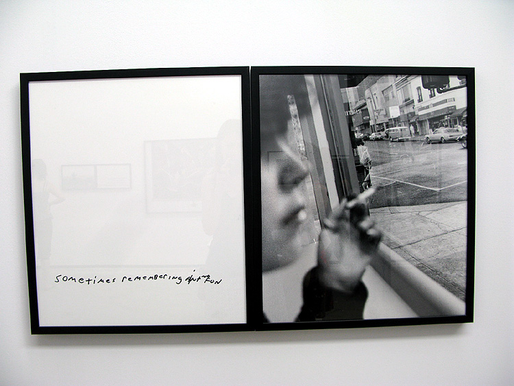
Of all the photographs with writing on them, I think I was attracted to this one the most because of the cohesiveness of the image. The fact that the image was re-photographed with the text allowed me to believe that it belonged there. Although I find it a little cheese, it works. The font is appropriate for the image and subject and the picture has none of the cliché that the words hold. 


What first caught my eye about this diptych was the focus on the woman's hair and not her face. because of the depth of field and perfect exposure the image implies professionalism or at least a professional camera. However the focus reverts back to the fact that its still just two kids playing with the camera. it is a beautiful balance between playful childishness and decent technical quality. 


Though this image is not the image of the stranger, it was a product of the conversation that ensued. The interaction between the photographer and the stranger he photographed lead the photographer to this place and this image. Aesthetically, it is one of the better pictures from the assignment, but conceptually  I think it fits with Soth's purpose beautifully. it is all about the idea of going back to the basics and then letting that lead us out again. 


I chose this image for two reasons, one the light and two the color. first, the play of the light across the child's shirt and back into the shadows very interesting. At the same time, none of the details in the shadow arias are lost. Secondly, the blues in the image fit so well together. the range from desaturated blue of the carpet to the bright blue in the upper left, the green blue of the shirt to the pink of the run and the child ear; it is all so well coordinated and balanced it could be a color study. 

Sunday, February 6, 2011

Philip-Lorca diCorcia

Philip-Lorca diCorcia on "Hookers" and "Thousand"


The first think to strike me about diCorcia's photography was the grungy, Nan Goldin-esque, style and subject. The photographs appeared to me like something the photographer snagged at the local club, a quick snap shot taken before the subject has time to react. In part, I was right in this, and in part I was drastically wrong. The first series "Hookers," the one I found most similar to Nan Goldins work was actually executed more in the style of Jeff Wall. The photographs are set up, the lighting is found or staged, Polaroid's of assistants make preliminary sketches and then finally diCorcia finds a hooker to pose for the picture. The second series, "Thousand," is comprised of a thousand Polaroids. These are all pictures that were shot as photographic sketches. Precursors to the final photograph, snapshots of family and friends, and just random pictures of everyday things. When looking at these two series, it was amazing to see how they both influence each other. Though the Hooker pictures loose the cheep flash and soft focus quality that are in many of the Polaroids, they retain much of the low-light, quick composition and muted color palate that define the Polaroids.