Monday, April 18, 2011

John Pfahl


With in this series John Pfahl shoots through a series of windows, often with picturesque or at least distinctive views. In his artist's statement, he mentions the idea that his view point is controlled by the vision of some one else, the architect, the decorator, the landscaper, etc. I think it is this idea that draws me to the series more then anything. The project is a lot like a school assignment; he is given a preset frame and scene but then it is up to him to make the subtle movements that bring together a composition. In this case, the centered cars and building are the major compositional element while angled lines of the pavement, and the perspective on the building play minor directional roles. More then anything, the richness of the texture and grit in the color is what really brings this image to life. The browns in the pavement and blues in sky as well as the yellow light bulbs really create a beautiful atmosphere.


In this image, the window almost turns the photograph into a strange sort of triptych. the careful placement of the window panes flattens background into what could easily be another photograph. To prevent this from totally flattening the image Pfahl includes a table and book in the foreground. Though the book cover is not perfectly clear, the colors and formation on it seem to reflect what is just outside the window. Though it may be a tint on the window, the center pane appears much lighter then the outer two. Although this does allow for more detail in the trees and land below the rays of the sun, it mutes the right yellow and blue that show up in the other two windows as well as the book. 


This window is different from his others in that the surface is more the subject then what is beyond. The broken glass and wire mesh give the air of an abandoned city building. This in combination with the angular form that is beyond the window makes me fairly certain that it is in a city. When composing this, Pfahl was carful in his placement of both the vertical and horizontal elements of the picture. Rather then shooting the window just perfectly dead on, he moved to make sure that the vertical edge of the building lines up with the thick vertical window pane. Horizontally, he divided the back ground into three parts. The sky takes up one row of frames, the grey part of the building takes up two, and the darker section covers the remaining two.


Monday, April 4, 2011

Joel Meyerowitz


When thinking about Meyerowitz work, it is important to keep in mind his intent: to capture as completely as possible the feeling, the atmosphere, or a scene. His use of the color is supposed to be a purely accurate description of what he sees. As simplistic as this seems, it is interesting to look for what it is that he chooses to include. Though he is trying to be honest in his 'document' of the environment, he is still making choices as to what to include and what not to include. In this image, for example, he makes the decision to include the car, and not just a little bit of it. He portrays the feeling of this particular place as the tan interior of what looks like an overheated van. Some how, the inclusion of so much of the van makes it feel warmer. Although I am sure it is hot outside too, the color of the interior and the way the light falls through the windows amplifies and confines the feeling in a way palm trees and blue skies wouldn't.


In this image, it is the handling of what is in and what is not in the frame that really show Meyerowitz attention decision making. He places the frame in such a way that he can get the most out of the scene. From the sliver of a man on the far left to the person entering the frame on the right, from the central figures knees to half way up the skyscrapers behind them. It feels like each decision he made was something of a compromise; he chose to leave out the feet of his subjects to show the little bit of the sky that gives the city its feeling of ascension. He cut back on the man to the left to show the motion of the one on the right. Perhaps the most striking feature of the photograph is the strong diagonals coming from either side. Though the close in on the picture, they are characteristic of the depth and seeming endlessness of the streets in the city. 


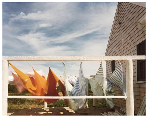
This photograph stood out because of the blatant use of the limitations of the photographic medium. In much of Joel Meyerowitz work, the camera becomes lost in his attempt to include as much as possible. Here however, he is not trying to hide the camera; instead, he uses the limitations of a slow shutter to enhance the feeling of wind and motion that the picture has. The wispy clouds and the swirl of the laundry play off each other, giving the impression of a gusty day. This is counteracted by the solid form of the house which fills the right half of the frame as a imposing force, there fight the wind. Though the close crop and use of motion blur seem to depart from Meyerowitz typical style, he uses them effectively to portray the feeling of that particular moment. 


Monday, March 21, 2011

JoAnn Verburg


In the photography of JoAnn Verburg, the selective focus and focal planes of the eight-by-ten she shoots with are used to dramatize her otherwise ordinary subjects. Even in this image, a situation where the view camera would be ideal for maximum depth of field, she choses to place the focus on the first window, letting the viewer guess at the rest of the image. Her typically pastel color pallet lends its self to the air of mystery present in so much of her work. Formally well composed, this image takes a more geometric approach to composition then much of her other photography. The dark triangle in the bottom left balances the light triangle formed by the windows in the top right. The slice of ground that leads to the door on the right is played off with the inclusion of the structure behind the wall on the top of the same side.


More so then the previous image, this photograph is characteristic of Verburg’s whimsical, dream like, style.  Once again the bright day light and pastel colors suggest a happy, cheerful place.  The entire image is a balance between the blur selective focus and the crisp points where she brings out her chosen subjects into sharp clarity. Here the close tree branch and then the tree behind it are the subject of her focus. This duality suggest a macrocosm-microcosm theme in which both the individual part and the group as a whole are shown in comparison.  


Diptychs, triptychs and polyptychs make up another facet of Verburg's work. The choice of devisions with in this specific piece are especially fascinating. across the horizontal borders, the images line up fairly well, the news paper seems continuous as do the tress and wall. However, when moving vertically the transitions are less smooth. Here the movement from one set to the next is prohibited by the focus selection, a deliberate tool which JoAnn Verburg enjoys using. At first glance the leaves above the man appear as though they belong below him. the selective focus masks the wall that they sit on and puts the bench in an underground world. Once again the soft focus on the trees plays an important part of the transition. She effectively throws the top set back ground by choosing to only focus on the upper half of the images, making them feel distant while still retaining detail in the upper parts. 

Sunday, March 13, 2011

Lynn Saville


When I saw the title of Lynn Saville’s book “Night Shift” I immediately knew I was going to enjoy the work. All night photographs in full color, all brimming with the tones and shades of a thousand street lamps and outdoor house lights, the series is an investigation of the beauty of artificial lights. In this specific picture, the green interior light spills out onto the pavement, looking like an alien presence in comparison with the natural blue and slight pink of the sky. The bridge overhead breaks up what mass of blue creating another formal element that plays off of the dark building, almost becoming a continuation of it.  

Thomas Demand


Demand's pictures are purely about formal relationships. The tightness of the compositions in terms of both line and color turns his photographs into what could by a 2D study of composition. Though the images are of spaces, he uses stopped down apertures to achieve a depth of field long enough to flatten the space into one plane. This particular image is comprised of parallelograms of varying sizes and colors. The larges elements are the orange and blew of the two tables, the turquoise of the floor and the gray of the two machines. Each of these shapes is balanced by the smaller shapes the break up the larger masses, the telephone, control box and plastic tubs. Every border is engaged while the space within is fully activated.

Miguel Rio Branco


I stumbled across this photographer in the library while shelf-reading and was immediately intrigued by his use of color. His photographs move between documentary subjects with a fine art eye, as is the case here, and Nan Goldin style subcultures of Brazil, with low light and lots of motion blur. In many of his photographs, Miguel mixes light temperatures to achieve the range of colors his images exhibit. In this image, the subject is the shoe that is falling apart; however, the interest of the photograph is the color play between the blue smoke and rocks and the read earth. Perhaps achieved by combining fire light and day light, it is this juxtaposition that gives the photograph life.

Monday, February 28, 2011

Hines, Summer, Speers


Jessica Hines

My Brother’s War, a series by Jessica Hines, is a powerful series. The entire thing is a Morell like juxtaposition between the two-dimensional (images, pictures, letters, book pages,) and three-dimensional. She uses the flat to serve as a literal representation of the past while placing it in a very real and current space. Her especially strong images are the ones where she finds ways to integrate the two through visual relationships. She uses horizon lines and geographic features to unite landscapes and photographs as well as light reflections and glass magnification to mix written documents and their surroundings.


Louisa Marie Summer

In this next series, Jennifer’s Family by Louisa Marie Summer, the main idea was to give a view of urban poverty based off interaction with one family. This series however struck me as what David Hurn called exploitation. It felt like something that had been shot over the course of a week with little to no real interaction between the photographer and the subject. There was no apparent deep connection to the family, and, in all truthfulness, the series did not break down any stereotypes as the artist had hoped. For this to be successful, Summer would probably have had to spend the next decade with that family. If any real truth were to rise to the surface, it would not come from a weekend photo shoot at the neighbor’s house.


Vee Speers

The Immortals is a puzzling series. I am torn between hating the aesthetic of it and loving the concept. It’s basis in the twisting of our ‘ideal of beauty’ and comparison between the modern Photoshop ideal and the historic painterly ideal create an almost painfully perfect view of extremely fake youth. Backed by the statement of purpose, this works well, however alone the images seem overdone. Even with the statement, they are on the borderline of too much. Perhaps a realistic back ground or less edited foreground would have brought the images back to a reality we can identify with.

Monday, February 21, 2011

Soth assignment


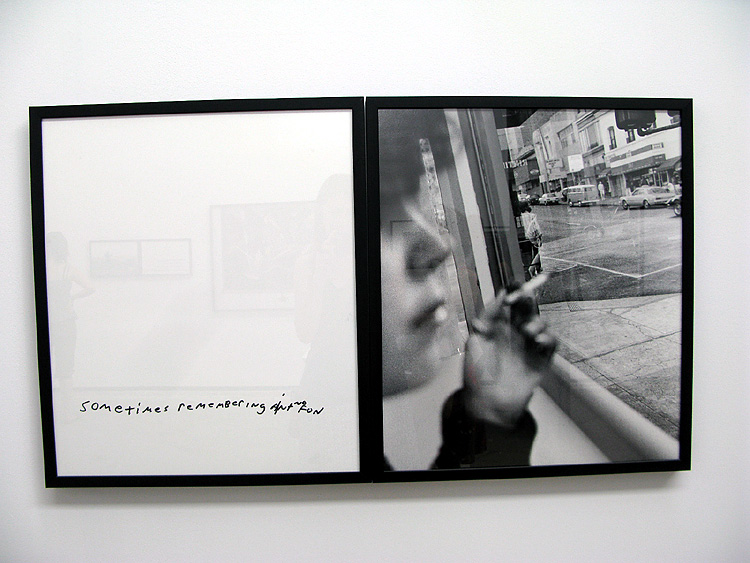
Of all the photographs with writing on them, I think I was attracted to this one the most because of the cohesiveness of the image. The fact that the image was re-photographed with the text allowed me to believe that it belonged there. Although I find it a little cheese, it works. The font is appropriate for the image and subject and the picture has none of the cliché that the words hold. 


What first caught my eye about this diptych was the focus on the woman's hair and not her face. because of the depth of field and perfect exposure the image implies professionalism or at least a professional camera. However the focus reverts back to the fact that its still just two kids playing with the camera. it is a beautiful balance between playful childishness and decent technical quality. 


Though this image is not the image of the stranger, it was a product of the conversation that ensued. The interaction between the photographer and the stranger he photographed lead the photographer to this place and this image. Aesthetically, it is one of the better pictures from the assignment, but conceptually  I think it fits with Soth's purpose beautifully. it is all about the idea of going back to the basics and then letting that lead us out again. 


I chose this image for two reasons, one the light and two the color. first, the play of the light across the child's shirt and back into the shadows very interesting. At the same time, none of the details in the shadow arias are lost. Secondly, the blues in the image fit so well together. the range from desaturated blue of the carpet to the bright blue in the upper left, the green blue of the shirt to the pink of the run and the child ear; it is all so well coordinated and balanced it could be a color study. 

Sunday, February 6, 2011

Philip-Lorca diCorcia

Philip-Lorca diCorcia on "Hookers" and "Thousand"


The first think to strike me about diCorcia's photography was the grungy, Nan Goldin-esque, style and subject. The photographs appeared to me like something the photographer snagged at the local club, a quick snap shot taken before the subject has time to react. In part, I was right in this, and in part I was drastically wrong. The first series "Hookers," the one I found most similar to Nan Goldins work was actually executed more in the style of Jeff Wall. The photographs are set up, the lighting is found or staged, Polaroid's of assistants make preliminary sketches and then finally diCorcia finds a hooker to pose for the picture. The second series, "Thousand," is comprised of a thousand Polaroids. These are all pictures that were shot as photographic sketches. Precursors to the final photograph, snapshots of family and friends, and just random pictures of everyday things. When looking at these two series, it was amazing to see how they both influence each other. Though the Hooker pictures loose the cheep flash and soft focus quality that are in many of the Polaroids, they retain much of the low-light, quick composition and muted color palate that define the Polaroids. 

Monday, January 31, 2011

Stephen Shore


Though this image follows the documentary style that bothers me so much with most of Shore's work, I find the picture interesting in a way that is uncommon for this upfront, building photography. The juxtaposition of the white, brown and gray houses. Though different colors are normal and even expected, the uniformity of the designs give the impression that they should look the same in all other ways too. The flat, upfront approach serves to add to this feeling of expectant uniformness, all of which is shaken by the shift in color. 


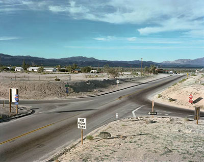
This photograph is made up of a lot of little details that dont really strike me as that important until they are all added together. The shadow of the road sign of the far left points in to where darkened part of the road and the white line form twin arrows. The shadow of the do-not-enter sign hits the hill in such a way that it parallels the upper arm of those two arrows. The dark streak on the road is balanced with the darkening sky on the opposite side of the frame. In the same manner the white of the no-right-turn sign is balanced by the back of the sign on the left. 


To use Ron's favorite hypothetical portfolio review question, "Why should I care about this?" I honestly dont want to look at Shore's McDonnell's meal. Not only is the subject totally bland but the handling of it is just as flat. Flat overhead, florescent lighting, no highlights no shadows. Strait on I'm-about-to-eat-this-but-I-have-my-phone-so-I'll-take-a-pic-and-send-it-to-my-bff view. Oh and he doesn't even take the time to balance the pole sprouting out of the top. He didn't bother to move a couple inches to get rid of it, or a couple inches in other direction to balance it with something on the bottom. The graffiti has potential and thats probably what he saw, but really, it just didn't work. 

Saturday, January 22, 2011

Todd Hido


Todd Hido's pictures of the interiors of foreclosed houses shows a beautiful handling of light, color, and geometric shape. The recession of the wall, where it meets with the closet and the positioning of the doors all balance to create a simple and eloquent composition. The gentle blue and pink of the cool lighting creates and empty and deserted feeling to the space. This also illustrates how the article described the infinite number of shots that could be taken while only one is the right one. Though this room and even this corner could have been shot from any number of angles, but this one picture that the photographer chose as the "right" one, the one where all the elements align to create balance and calm.

Alec Soth


Though all architecture pictures lean towards a geometry base, this one uses it especially well. The zigzag of the stairs, ceiling and floor are balanced by the solid forms of the door and window on opposite sides. In terms of color, this picture tends towards the "ignore" tactic; what ever color is there is washed out by the flat light. The color plays little to no part in the photograph which is made up purely of composition. Again the subject of the photo has no historical or philosophical significance. In its self, the staircase isn't even a very beautiful one, it is the photograph the makes it aesthetically pleasing. It is not a recording of some eloquent quality that is evident in this rather derelict space; rather the photograph has moved past recording to create its own beauty, just as described by Szarkowski in the reading. 

Doug Dubois


The first thing to strike me about this photograph was the two dimensionality of the space. It seems entirely flat. Secondly, I was surprised by the precise arraignment of all the elements. It is so clean cut, that it is hard to believe that the dinosaur is actually flying and the cild is still in motion. The balance between the blue bottle on the right and the soup holder, as well as the child's eyes and the dinosaur is uncanny. Just as stated by the article, it is a "tension so exact that it is peace." The simplicity and just plain regularity of the subject here is a perfect example of the photography discussed in the article. The subject has no deeper significance then the "pretext for the making of color photographs." 

Friday, January 14, 2011

William Eggleston


A simple street running past a plain house, this image is transformed by the cold, wet, predawn atmosphere of the picture. There is nothing extraordinary about the subject; the attraction is in the lighting. The color almost looks like a tint and, except for a slight warming in the middle of the street, the same effect could be achieved by tinting a black and white photograph. With out the color, the image would still be just as intriguing and mysterious, but it would not have the same cold morning feel that this gives me. I think I like the use of the color for the place setting; it adds an extra piece of information. The large amount of void black in the bottom left bothers me, although the reflective bit of wall does serve to break it up just enough to make it passable. 


The first thing to draw me to this picture is the strong composition. It seems pretty basic, the two descending verticals leading towards the vanishing points of the four receding lines that radiate out of the center of the right half of the image. It is a simple and eloquent handling of the classic vanishing railroad. The color is a warm wash of low sunlight. The orange light brings out the yellows of the fall trees and the brown and red in the rust and decay on the tracks and posts. In black and white, the image would be far more abstracted; there would be no way off guessing time of year and day. Though it would still work in black and white, it would be far less interesting and would need a lot more contrast. 


Of all the Eggleston photos I looked at, the subject and possible 'meaning' of this held my attention far longer then any of the others. In his typical everyday style, the image is of something totally normal even obnoxiously mundane, the back of a woman's head. What makes this picture interesting is the presence of the she blots out, made apparent by the hand holding a cigarette on the opposite side of the table. In terms of color, the two dominate colors are the red of the brick and the faded green on the booths. Shades of pink and red flow through the table, the woman's shirt, and the menu. This juxtaposition of complimentary colors adds a strange tension that would not be there were the picture in black and white. I especially like the clash between the light green and the pink of the woman's shirt. Another intriguing correlation is drawn between the cigarettes that both the figures hold. These slight gestures bring the eye around that side, leading back towards the middle while some not vignetting contains the upper corners. 


Monday, December 13, 2010

Niki Barbati


In this picture the buildings and the sky interact to create an almost abstract image of geometric shapes. the key shape is that of the sky. A slow shutter speed was probably used alone with some serious dodging to achieve the tone and blur in the clouds. A wide angle lens was probably necessary to get a view that includes so much of the buildings on each side. Though it looks almost HDR, I would guess that it is just a lot of dodging and burning based on the light on the edges of the buildings. 

Jason King


This is another photograph that shows that uses a dynamic negative shape to connect the architecture. Here smaller elements are used up-close to act as similar elements as the buildings. The light and the banner both feel as colossal as the buildings and function on the same plane as them. The curve of the light post and the arches on the building relate easily to the ripple of the banner. The corner of the building in the bottom left closes off the negative shape though it remains open on the other side. The sky is slightly gradated which contains the photograph space slightly but it still feels a little too open to me. 

Eric Kim


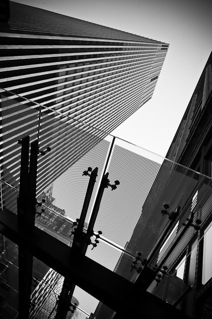
After seeing Eric's photography, I have started being more aware of the space and negative shapes made by buildings in the city.  This photograph is an especially strong example of how that negative shape can be used to activate the photograph. The titled camera allows the overhang to keep they diagonal zigzag going rather then grounding it as it would if that heavy black line were horizontal. The sky is handled by some subtle vignetting in the upper right hand corner. This gradation of the sky contains the photograph, allowing the eye to continue in a circular motion around the frame.

Monday, December 6, 2010

Matt Weber


Flat photography usually dont interest me but in street photography, I really like graphic element it adds. The shapes of the railing and the mosaic activate the space, balancing each other out. The girl adds the crucial element of interest being the subject. The scuffs on the wall appear to be confetti spewing from her outstretched arm; her upturned face drawing the attention into the picture. Her shape is perfectly balanced by the inclusion of the protruding piece of wall decoration in the opposite corner. 


The dramatic light created by the fog here really makes this picture. The contrast between the soft and swirling fog and the hard edged city seem to pull the human shape between two worlds. The fact that the figure is fully covered by the fog allows it remain some what isolated from the city. The lines from where the street meets the buildings draws the eye into the center as do the verticals above it. The distance from which the picture was taken makes it feel more like an intrusion on a surreal almost ritualistic moment. 


The real strength in this picture lies in the subject, 9/11. However it's unconventional view of the towers shows a side of it not seen from the plethora of after math pictures shown in most newspapers. The inclusion of the children who are completely oblivious to what is happening around them and the mother, forced to ignore it so she can continue taking care of her kids turns the focus towards the affect on the rest of America. The diagonals in the image draw the focus to the distant and muted towers while the contrasts make allow the figures to maintain the center of focus. 


Saturday, November 27, 2010

Ian Smith


The tonal range of this photograph is what really draws me into it. The shades on the hall of the sip, the white of the surf, the details in the sky, every surface has a full tonal range in the textures that cover each surface. compositionally, the photo is basic and strong. The diagonal chain draws the eye in to the diagonal that the axis of the ship makes, perpendicular to that of the chain. The foam on the beach mimc curve of the hull while the clouds balance the ships reflection. Technically the image is eloquent and well refined. Conceptually, there is also a lot to work with. The image of the anchor and the chain both lend them selves to some form of captivity, an idea very appropriate for a beached vessel. The angle of the ship makes it seem like it is almost straining against the chain, fighting to get free. Yet at the same time storm clouds are forming overhead. 


Though this picture is by the same photographer, of the same subject, the image is no where near as successful as the first photograph. The choppy water and blank sky are what really destroy it; the size of the waves take away from the monumental feeling of the other image, while the bare sky bleeds out a lot of potential tension, not to mention the fact that it takes up two thirds of the frame with absolutely nothing. The slightly tilted horizon is just enough to annoy with out really adding anything to the picture. This is what much of Ian Smith's photographs looked like, relatively unimpressive, rather snap shot like. 


Everything that was done wrong in the last image seems to have been done right in this one. The photographer took advantage of the size of the ships to get right up close, turning them into looming shapes. He used the ropes to draw the eye up into the center where the ships meet creating an x shaped composition. The smaller ship on the right and the water line and the water line on the middle boat both serve to continue the horizon that appears only in a fraction of the frame on the far left. The sky is a slight gradient moving from white to a light grey on the right hand side, framing the middle craft. All of the elements are well handled and thought through; there is none of the randomness that destroys of some of his other images.

Tuesday, November 23, 2010

Hierarchy


To illustrate hierarchy, I plan to use human relationships as shown through gesture and body language.  With the pictures I intend to destroy the traditional thought of hierarchy as all encompassing levels of importance and show it as the intricate micro-relationships that actually make up society.


This first image is a Henri Cartier-Bresson shot. It is easy to assume this is a grandfather-granddaughter relationship because of the protective way the man surrounds her. The direct eye contact and crossed legs show a confidence bordering defiance directed towards the photographer. Doubtless this is brought on be the presence of the man whose hands and legs surrounds the child. Heretically, the man is more important; he is older, wiser, part of the work force, probably the main provider for the family; however the photograph shows him as protective and comforting. These are the type of relationships I want to use to show human hierarch. Though I do not intend to stage my photographs or even allow my subjects to know they are being shot, the photograph still shows the type of relationships I want to portray.


Here, the photographer, Lev Tsimring, captured a far more subtle hierarchy. The relation is between three supposed siblings as the two eldest teach the smallest child to ride a bike. The tallest of the three wraps his arm around the child on the bike as though lifting him up to take him off the bike which is too large, probably a possession of the older boy. There is a clear hierarchy between the three, but the way they are helping each other shows how social relations are used to support and help people.


Handshake by Laurent Roch shows clear hierarchy. The seated verse the standing, the way the man on the left stoops over to sake the other man’s hand, the embroidered hat and the uncovered head, all of these contribute to the feeling that these two are at different social levels. Despite this, the image catches the moment of meeting. In this introduction, their faces show genuine surprise and pleasure at the union, complicating the hierarchy of the positions. It seems to lead to a moment where the seated man stands up to greet the other, symbolically a removal of the previous hierarchy.


Though this picture is about the juxtaposition of the food add and the family Julian Legrand captures the relationships without the conventional use of faces and heads. The relation of the three is made clear by simple body language. The largest figure is probably the father; his wife is to the left and a son with his hand over the man’s shoulder. The lack of heads in this shot is what really draws me to it; this is a technique I may try with my own pictures to focus on the way people orient themselves around each other.


Another Lev Tsimring, this picture is a very comical take on the idea of hierarchy. The expensive looking sweat pants, the loose baggy jeans, and then the canine. It is an easy line up to see hierarchy in an amusing light. As with the last image, the photographer chose to crop out the heads of the people, focusing in on the symbolism of the way the figures are clothed (or otherwise).


The idea of hierarchy is often characterized by a conflict or struggle that establishes that hierarchy. This picture by Richard Ford shows a checkers game by tow people who seem appear to be foils. They are close enough in age that they appear to be well matched competitors. However, they are opposite in build and dress. Their respective dark and light suits seem to mimic the conflict on the board, personalizing the checkers game.


This photograph by Lukas Vasilikos shows a very clear hierarchy: that of the family. The progression of youngsters surrounded by their parents is mimicked in the sign on the shop window of the human evolution. Though the comparison is comical, the family hierarchy is none the less present. In terms of how it manifests its self visually, the parents are shown walking at the front and back of the procession of kids, shepherding them forward.


The correlation between figures here is made by the shopping bags. The photographer, Michael Penn makes the connection between the child and the two adults in the back ground with the triangle of white plastic grocery bags. These forms seem to hint at the bags that they homeless carry their possessions around in. The child seems to be following the example of the figures before him, carrying around a bag too large for him to lift off the ground while still struggling to move forward.


This is another shot by Richard Ford. In this one he shows a clear progression in line of people as their heads steadily get lower in the frame. Although this arrangement appears to be simply lucky placement, the implication is of some social order that reflects the importance of each person in the group. Besides their position, there is nothing to suggest any form of hierarchy between them. They are all of approximately the same age and appear to be off similar economic background, but the placement of the head is such a symbol of authority that the progression overrides all other symbols in the photograph.


Any form of line implies a hierarchy, some sort of order of significance that being shown the apparently organized position.  In this photograph the reason behind the order can only be guessed at. The three standing elderly people appear to be looking down on the seated woman who waits like them next to the street. A fourth figure also looks towards the seated woman; she, however, stands apart from the others, implying a social distance, though not as great as the distance between the three and the figure farthest to the right. The slow shutter speed allows the moving crowd to blur away into the back ground, bringing the visual relation of the four standing figures into sharp focus.